Statistics for Analysts Who Hate Statistics, Part III: Principal Component Analysis
LCGC North America
Part III of this series takes a closer look at principal component analysis (PCA). PCA can be very useful for observing your data when the observations you wish to compare are described by many variables. It is a relatively easy way to obtain a simplified image of the data, while trying to maintain as much information as possible.
Part III of this series takes a closer look at principal component analysis (PCA). PCA can be very useful for observing your data when the observations you wish to compare are described by many variables. It is a relatively easy way to obtain a simplified image of the data, while trying to maintain as much information as possible.
Surely, you have all heard about principal component analysis (PCA) (1). You have even seen figures, and not necessarily understood all of them. PCA can be very useful for observing your data when the observations you wish to compare are described by many variables. It is a relatively easy way to obtain a simplified image of the data, while trying to maintain as much information as possible.
Imagine a fish. The fish exists in a three-dimensional (3D) space, but if I ask you to draw a fish on a piece of paper, you will probably draw something very much like Figure 1. Note that you have reduced the dimensions to two, but everybody will still understand that you have represented a fish. And if I draw a shark, the difference in the two representations should be clear enough to perceive the significant differences between the two. What PCA does is very similar to that: It will produce a simplified image, while maintaining significant features.

Figure 1: Two simple representations of a fish and shark.
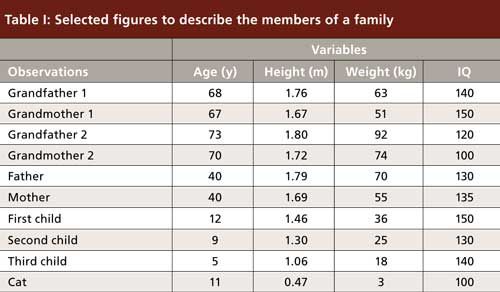
Let us start calculating with a simple case study, not related to chromatography. I will compare the members of a family (for PCA, they will be called “observations”), scattered over three generations. We can collect numerical data for this family, such as age, height, weight, and IQ (for PCA, these features will be called “variables”). An example is presented in Table I. There is wide diversity among this family. To compare the variables, we should normalize the data, because they vary on different scales. If we do not normalize, IQ will have the strongest weight on the final image, whereas height, expressed in meters, will have the smallest impact. Normalizing is easy: It means that for each column of data, we will subtract the mean and divide by standard deviation. As a result, all columns will have a mean value of zero and standard deviation of one. This is why normalization can be described by “centering and reducing” (they all have the same center and same distribution range). Now we can compare all variables and they will all have the same impact on the final image.

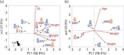
Calculating a PCA on this set of data yields Figure 2a. First, we can note on this biplot, combining observations and variables, that the first two principal components (PC1 and PC2) together explain nearly 95% of the variance contained in this sample set. This is a very good score and means that the projection on this space maintains most of the significant information (just as for the fish and shark). Because the variables describing age, height, and weight all point in the same direction, you may conclude that some correlation exists between them. However, because IQ is pointing to an orthogonal direction, it is not related to the other three: As we all know, IQ is not necessarily improving or degrading as we age.

Figure 2: PCA analysis of family members, based on Table I, (a) all members and (b) only adults.
Groups of people appear rather clear on this figure, with all adults being plotted on the right-hand side of the figure (“loaded” by high values of age, weight, and height), while children and the cat are on the left. High IQ values are not particularly encountered in any category of these people because the IQ variable points between these groups. The cat (to whom I arbitrarily attributed the average intelligence of a cat) seems to be an outlier, as it singles out in the bottom left corner, probably because her height and weight are clearly in a different range from the other family members. You may decide that she should not “belong” to this family and recalculate your data analysis without the cat. Actually, it makes sense to define subsets of samples, based on a priori knowledge, and see if your view of them changes in the resulting data analyses (2). In Figure 2b, I have retained only the adults. Although height and weight still retain some correlation, they are now unrelated to age (as they should rather be related to genetics, food, and sports habits).
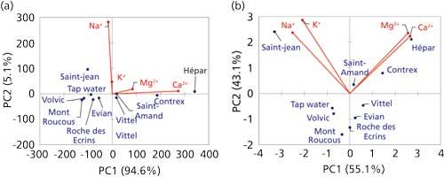
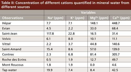
Let us move on to an example related to chromatography. A simple example is presented in Figure 3, which is based on an experiment I used to conduct in lab work with master students in analytical chemistry. Based on cation-exchange chromatography, the composition of several bottles of mineral water and tap water from different sources was assessed for sodium, potassium, calcium, and magnesium (Table II). Because all variables are now on the same scale and represent comparable things, we can decide to normalize the data or not. This approach will yield two different figures. In Figure 3a, the raw data were used; in Figure 3b, normalized data were used. Both figures represent nearly 99% of the variance in the sample set, indicating that there is nearly no loss of information because of data processing. We can compare the two figures easily. Note that in Figure 3a, PC1 is way more significant than PC2 (94% versus 5% variance explained, as indicated on the axis labels), thus the scattering of points in this figure is essentially significant from left to right, but not much from top to bottom. In Figure 3b, the variance explained on PC1 is 55%, versus 43% on PC2 (indicated in the axes labels), thus both the horizontal and vertical scattering of points are meaningful. However, it is clear in both cases that sodium and potassium concentrations are correlated. The calcium and magnesium concentrations are correlated because the variables point in the same direction, and sodium–potassium is unrelated to calcium–magnesium because they point to orthogonal directions.

Figure 3: PCA analysis of mineral water cation analysis, (a) with raw data and (b) with normalized data.

Because the calcium concentration reaches the highest values, it will have the strongest impact on PCA when normalization is not used, whereas potassium will have the least impact. Thus, in Figure 3a, we have essentially discriminated hard water sources from the others. In Figure 3b, we have given the same weight to all cations, and we are now discriminating hard water sources, salty sources, and freshwater.
Note that very large data tables may require more time for a PCA, so it is useful to spend some time carefully selecting the data (3) (select variables, remove noise, and uneventful sections from a chromatogram, for instance).
One difficulty remains: How should you define groups of observations based on a PCA plot? Defining the groups can be facilitated by clustering methods, which we will learn about in the next installment of this series.
References
- D.L. Massart and Y. Vander Heyden, LCGC Europe17, 586–591 (2004).
- A. Périat et al., J. Chromatogr. A1282, 72–83 (2013).
- Y. Vander Heyden et al., LCGC Europe24, 1–3 (2011).
Caroline West is an Assistant Professor at the University of Orléans, in Orléans, France. Direct correspondence to: caroline.west@univ-orleans.fr.

How Many Repetitions Do I Need? Caught Between Sound Statistics and Chromatographic Practice
April 7th 2025In chromatographic analysis, the number of repeated measurements is often limited due to time, cost, and sample availability constraints. It is therefore not uncommon for chromatographers to do a single measurement.
Fundamentals of Benchtop GC–MS Data Analysis and Terminology
April 5th 2025In this installment, we will review the fundamental terminology and data analysis principles in benchtop GC–MS. We will compare the three modes of analysis—full scan, extracted ion chromatograms, and selected ion monitoring—and see how each is used for quantitative and quantitative analysis.
Rethinking Chromatography Workflows with AI and Machine Learning
April 1st 2025Interest in applying artificial intelligence (AI) and machine learning (ML) to chromatography is greater than ever. In this article, we discuss data-related barriers to accomplishing this goal and how rethinking chromatography data systems can overcome them.


