But Why Doesn’t It Get Better? Kinetic Plots for Liquid Chromatography, Part 1: Basic Concepts
Choosing a liquid chromatography (LC) column for a particular application can be a surprisingly challenging task. On the one hand, column manufacturers give us many options to choose from, including particle types, pore sizes, particle sizes, and different lengths and diameters. On the other hand, we usually do not have time to experimentally evaluate many combinations of these parameters, and sometimes we end up picking something similar to the columns that are already in the drawer. The “kinetic plot” is a powerful graphical tool that can help leverage the best available theory to help us understand how different combinations of parameters (such as particle size and length) will perform in relation to the time needed to get to a particular column efficiency (and thus resolution), and therefore make well-informed decisions when choosing columns.
Fifty years into the evolution of modern liquid chromatography (LC) we are still observing remarkable growth in the commercial offerings of LC columns. Each year, we see introductions of columns prepared with superficially porous particles (SPPs) from more manufacturers, new column formats (such as pillar array columns), more particle types suitable for bioanalysis (such as wide pore particles), and so on. From an analyst’s perspective, these developments are wonderful because they give us more choices, and increasingly they give us options that are designed with specific applications in mind (such as columns sold specifically for the purpose of characterizing monoclonal antibodies [mAbs]). However, having all these options to choose from can also make purchasing decisions complicated. How do we know which column is the “right” one? Of course, with purchase prices in the $500–$1000 range, trying a large number of them is simply not realistic. In the worst-case scenario, making the wrong choice can lead to real disappointment and sunk costs. If we choose the wrong combination of particle size and column length and diameter and pore size for a particular application, we may find that the performance we observe (as measured by analysis time, resolution, and sensitivity) is not as good as we expected, or perhaps even worse than what we were already using.
The analysis time–resolution compromise is one of the most studied topics in the history of LC research. Although the issue may have been considered settled in the late 1990s, new developments over the last 20 years, including the use of pressures greater than 400 bar, particles smaller than three micrometres, new stationary phase supports, and the surge in interest in the analysis of biopharmaceuticals, are keeping things interesting (1,2). One very powerful framework that is used to understand how all these factors influence what columns we should use for which applications is the “kinetic plot”. For this first instalment in a multipart series on the construction and use of these plots in practice, I’ve asked kinetic plot expert Professor Ken Broeckhoven to join me in describing what a kinetic plot is and how it relates to the practical factors we care about most in LC—analysis time and resolution. In subsequent instalments, we will go on to show how these plots can be constructed from experimental data of your own, or data accessible to you, and finally how the resulting plots can be used to guide decision making when choosing columns, and help troubleshoot situations where a particular column does not deliver the performance expected based on intuition and community conversations.
Dwight Stoll
Analysis Time and Resolution Are Connected
A primary goal of most analytical separations is to achieve a certain resolution between one or more pairs of compounds in the shortest possible analysis time. More‑efficient columns enable realization of this resolution in shorter times. Column efficiency (plate number, N) as defined in equation 1 makes the connection between plate number and peak width (w1/2) clear:

If we compare two separations where an analyte of interest is eluted at the same retention time (tR), the separation with the higher efficiency will have narrower peaks because of the inverse relationship between
N and w1/2. Because resolution is also inversely related to peak width, higher plate numbers lead to higher resolution. As soon as we start discussing analysis time, the mobile phase flow rate matters: Higher flow rates lead to shorter analysis times, and vice versa. However, the plate number also depends on the flow rate, so optimizing a separation is not as simple as using the highest possible flow rate. The conventional framework used to relate the plate height and flow rate involves the concept of the plate height (H), or height equivalent to a theoretical plate (HETP), which is related to the column length (L) and plate number through equation 2:

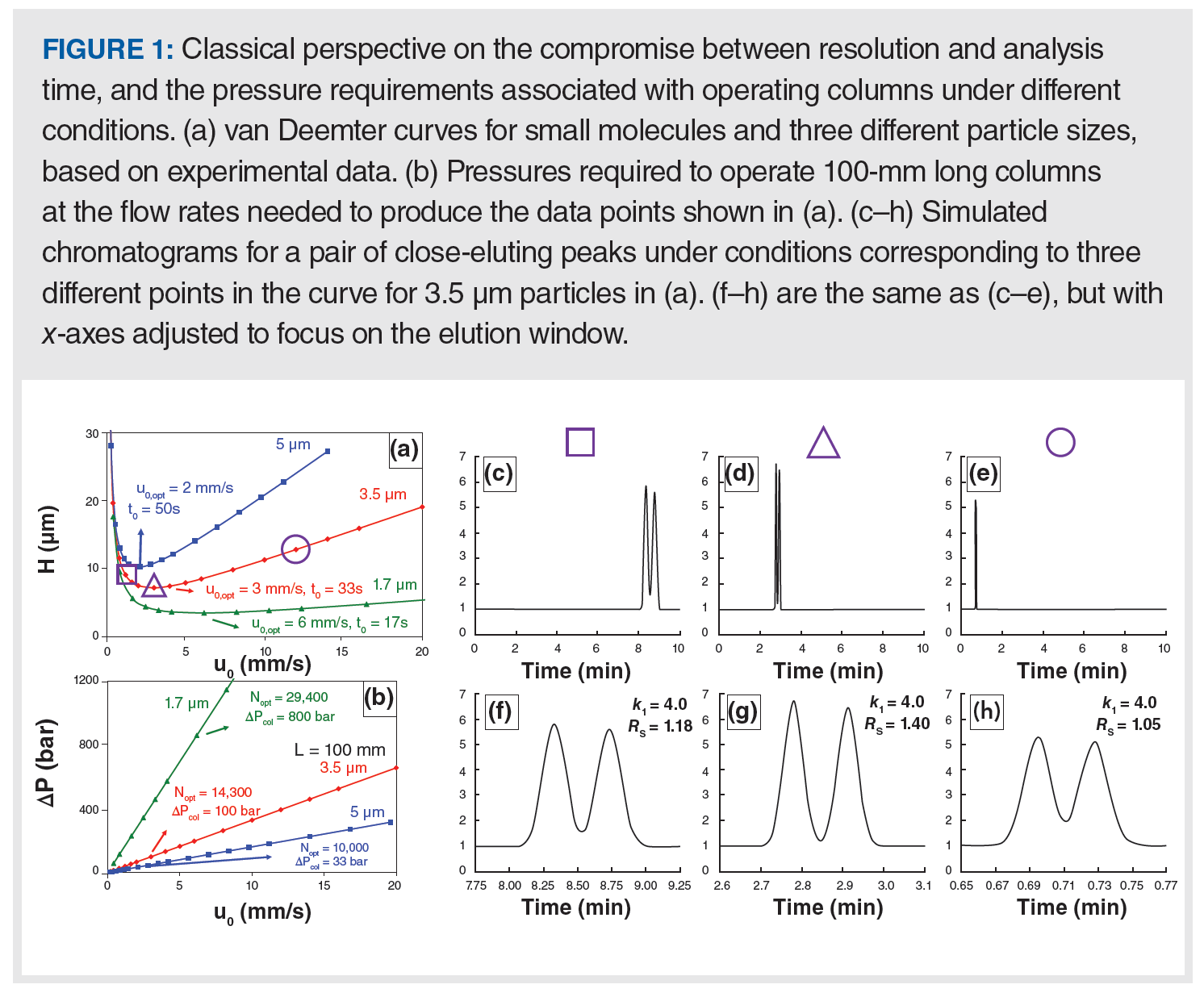
In rough terms, the plate height is a property of the material inside the column, but is also affected by the mobile-phase flow rate and the properties of the analyte. Increasing the diameter of the particles inside the column generally leads to larger plate heights and lower efficiencies, for a given column length. The relationship between the plate height and the mobile-phase flow rate has the characteristic shape shown in Figure 1(a), and is most commonly referred to as a van Deemter curve (3,4). Although for real separations we are mostly interested in the mobile-phase flow rate, van Deemter curves are usually plotted with mobile-phase velocity on the x-axis because the velocity is independent of the column diameter, and thus allows a comparison of the curves constructed from data obtained using different columns. The most valuable takeaway from the van Deemter curve is the realization that the smallest plate heights—and thus highest plate number and resolution—are obtained at intermediate velocities (not too low and not too high). However, the mobile-phase flow rate that produces the optimal (minimum) plate height—and thus the maximum plate number and resolution—is not necessarily the best flow rate in practice because analysis time is so heavily dependent on the flow rate.

It is instructive to examine the chromatograms that we would observe in experiments conducted with flow rates corresponding to three characteristic points on the van Deemter curve: a) the low-flow region (referred to as the B-term regime); b) the optimum (where H is at its minimum); and c) the high-flow region (referred to as the C-term regime). These three points are highlighted with purple geometric shapes in Figure 1(a), and the corresponding chromatograms are shown in panels (c–e) (full timescale) and (f–h) (zoomed view). These chromatograms make clear the practically relevant trade-offs that are encoded in the van Deemter plot, but can be difficult to appreciate without a lot of experience working with these plots. We call your attention to three main points:
- Working at flow rates below the optimum flow rate (where H is at its minimum) is almost never a good idea. Under these conditions the analysis will take longer than necessary—compare panel (c) to (d) and (e)—and the resolution will be poorer than what can be obtained at the optimum flow rate.
- The highest resolution is obtained by working at the optimum flow rate, which is clear in panels (f–h) where we see that the valley between the peaks is greatest in panel (g). The valley between the peaks is greatest in panel (g) because the peaks are narrower, which also leads to taller peaks.
- Much shorter analysis times can be realized by working at flow rates above the optimum, so long as some resolution can be sacrificed in the interest of a faster analysis. The resolution in panel (h) is clearly not as good as it is in panel (g), but this is a small change compared to the 70% decrease in analysis time. This trade-off, and the extent to which this game can be played with real separations, strongly depends on how steep the H vs. u curve is in the C-term regime. This slope strongly depends on particle size (slope generally increases with particle size, see Figure 1[a]), and the properties of the analyte (slope generally increases with molecular weight).
At this point, we encounter a significant limitation of the use of van Deemter curves alone for optimizing a separation—the plot does not explicitly communicate anything about the pressures required to realize chromatograms like those shown in Figure 1(c–h). The significance of this limitation is made dramatically clear in Figure 1(b), which shows the pressures required to produce the data points plotted in Figure 1(a). For example, it is true that a 100‑mm column packed with 1.7-µm particles will yield a plate number at the optimum flow rate that is roughly three times higher (29,400 compared to 10,000) than that for a column of the same length packed with 5-µm particles, and it will do so in one-third the time (optimum velocity of 6 mm/s compared to 2 mm/s). However, this improvement in plate number and speed comes at the cost of a significantly higher pressure requirement for the smaller particles. The pressure at the optimum for the 1.7-µm particles is 800 bar, whereas it is only 33 bar for the 5-µm particles. We also see here that one can also achieve a plate number of about 29,000 using a 20‑cm long column packed with 3.5‑µm particles at the optimum velocity, which would require a longer analysis time (roughly four times longer) compared to the column with 1.7‑µm particles, but only one‑fourth the pressure (200 compared to 800 bar). The van Deemter plot alone cannot help us manage the compromise between resolution (plate number), analysis time, and pressure requirements. However, the kinetic plot can help with this, and this is why it is so useful as a conceptual framework for optimizing separations and choosing columns.
Introduction to the Kinetic Plot Concept
Although many variants of the kinetic plot have been introduced and discussed over the years, a kinetic plot, in principle, is any method of presenting data that relates plate number to analysis time (5,6).
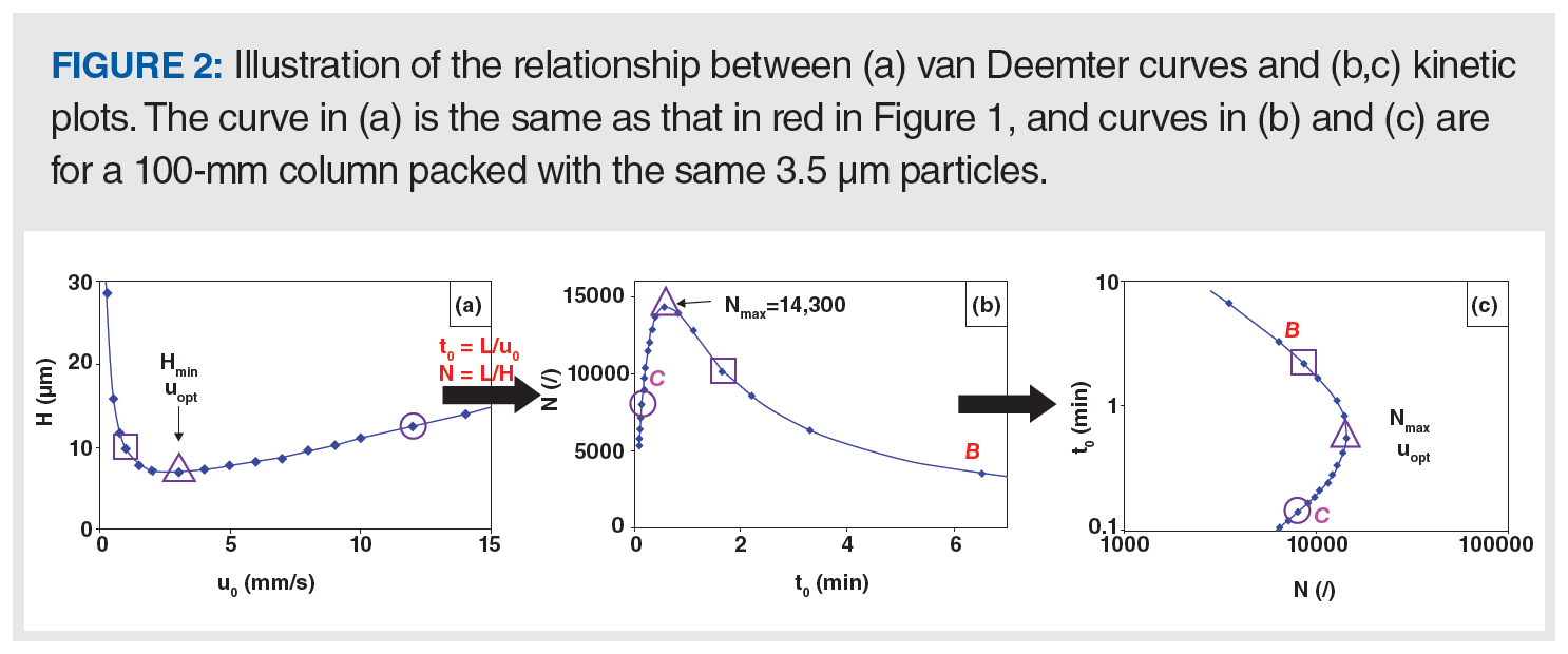
This type of representation is not new and dates back to some of the early publications of Giddings (7,8). Figure 2 shows the relationship between a van Deemter curve and a kinetic plot. To go from the van Deemter curve in panel (a) to the first type of kinetic plot in panel (b), the y-axis is transformed from H to N using equation 2. The x-axis is transformed from mobile phase velocity (u0) to column dead time (t0) using equation 3:

The kinetic plot in panel B makes the implications of the relationship between H and u0 for analysis time clear. Moving to the right on the plot—which corresponds to the B-term regime discussed above—leads to longer analysis times and poor efficiencies, which is not good. On the other hand, moving to the left of the maximum in the curve leads to much shorter analysis times, albeit at a slight cost of reduced plate number. The kinetic plot in Figure 2(c) is a simple transformation of the plot in panel B. The axes are reversed, and each axis is presented on a logarithmic scale, which helps visualize the relationship between t0 and N over a time range that spans from a few seconds to tens of minutes.

Adding the Dimension of Pressure to the Kinetic Plot
The kinetic plot in Figure 2(c) is sometimes referred to as a “fixed length kinetic plot”. Although it does make explicit the connection between analysis time and plate number, it does not make clear how the pressure limitations of a particular LC system (or column type) influence column selection.
The fixed length plot can be extended as shown in Figure 3 by adding multiple curves, each representing a different column length. On each curve, moving from the top of the plot towards the bottom corresponds to an increase in flow rate until the maximum pressure of the system is reached, where the curve terminates in “X”, and intersects the grey line. This grey line represents the “kinetic performance limit”, which defines the maximum achievable plate number for a given analysis time, or the shortest time needed to obtain a given plate number, depending on your perspective. Such families of curves can yield very instructive insights related to column selection. Consider the vertical dashed black line that intersects the curves for the 10-, 15-, and 25-cm columns. This view makes it immediately clear that there are multiple ways to obtain a plate number of 10,000 using columns of different lengths, but all packed with 3.5-µm particles.
The most time-inefficient way is to use a 25-cm column and operate it at low flow rate. In this example, the column dead time would be approximately 15 min (intersection of the dashed vertical line and the green curve), which is in spite of the fact that we generally think of long columns as being more efficient. Although it is true that longer columns have the potential to produce larger plate numbers, this potential can only be realized when the column is operated the “right” way. The next best option out of those shown here is to use the 15-cm column, which would produce 10,000 plates with a dead time of about 4 min. By far, the best way is to use the 10-cm column, operated at a velocity above the optimum, where the dead time would be about 10 s, a 90-fold improvement over the use of the 25-cm column at a low flow rate. Another way to look at this is to fix the analysis time at 0.9 min (horizontal black dashed line). Using a 10-cm column, this corresponds to operation in the B-term regime and only a little more than 10,000 plates are obtained (Note that by operating the same column length in the C-term, the same efficiency is reached in only 10 s, as shown for the vertical line). Operating a 15-cm column at the optimum velocity, a much higher efficiency of 21,600 plates is obtained, clearly making it a better choice. However, when operating a 25-cm long column slightly above its optimum flow rate, even 33,000 plates can be obtained in 0.9 min.

Summary
This instalment of “LC Troubleshooting” is the first in a multipart series aimed at providing a framework for troubleshooting separations that don’t perform as expected based on perceptions about the influence of variables including column length, particle size, and flow rate on column efficiency and resolution. The van Deemter curve—in spite of its frequent use for relating plate height and mobile-phase velocity—does not explicitly indicate the trade-off between analysis time and plate number (and thus resolution).
The kinetic plot is a graphical tool that does make this relationship clear, and can also incorporate practical limits on the use of certain columns based in the pressure limitations of a LC system. In subsequent instalments in this series, we will explain how you can create your own kinetic plots using your data, or data from the literature, and then use these plots to guide decision making when choosing columns, and troubleshoot situations where the performance of a column in use does not seem to be as high as expected. Readers interested in a more comprehensive discussion of kinetic plots and related optimization tools are referred to several recent papers in this area (9–12).
References
- K. Broeckhoven and G. Desmet, Anal. Chem. 93, 257–272 (2021). https://doi.org/10.1021/acs.analchem.0c04466.
- K. Broeckhoven, S. Eeltink, W. De Malsche, F. Matheuse, G. Desmet, and D. Cabooter, LCGC N. Am Supplement 36(s6), 9–17 (2018).
- J.J. van Deemter, F.J. Zuiderweg, and A. Klinkenberg, Chem. Eng. Sci. 5, 271–289 (1956). https://doi.org/10.1016/0009-2509(56)80003-1.
- A. Andrés, K. Broeckhoven, and G. Desmet, Analytica Chimica Acta. 894, 20–34 (2015). https://doi.org/10.1016/j.aca.2015.08.030.
- G. Desmet, D. Clicq, and P. Gzil, Anal. Chem. 77, 4058–4070 (2005). https://doi.org/10.1021/ac050160z.
- G. Desmet, D. Cabooter, and K. Broeckhoven, Anal. Chem. 87, 8593–8602 (2015). https://doi.org/10.1021/ac504473p.
- J.C. Giddings, Anal. Chem. 37, 60–63 (1965). https://doi.org/10.1021/ac60220a012.
- K. Broeckhoven, G. Desmet, and S. Jespers, LCGC Europe 30(6), 284–291 (2017).
- K. Broeckhoven and G. Desmet, J. Sep. Sci. 44, 323–339 (2021). https://doi.org/10.1002/jssc.202000779.
- P.W. Carr, X. Wang, and D.R. Stoll, Anal. Chem. 81, 5342–5353 (2009). https://doi.org/10.1021/ac9001244.
- S.R. Groskreutz and S.G. Weber, Anal. Chem. 88, 11742–11749 (2016). https://doi.org/10.1021/acs.analchem.6b03368.
- A.J. Matula and P.W. Carr, Anal. Chem. 87, 6578–6583 (2015). https://doi.org/10.1021/acs.analchem.5b00329.
About The Co-Author
Ken Broeckhoven received his PhD in 2010 from the Vrije Universiteit Brussel (VUB), in Brussels, Belgium. Following postdoctoral research at VUB and work as a visiting researcher in the separation processes laboratory at ETH Zurich in Switzerland, he became a research professor at VUB in 2012. He was subsequently promoted to Assistant Professor and then to his current position as Associate Professor in 2017.
About The Column Editor
Dwight R. Stoll is the editor of “LC Troubleshooting”. Stoll is a professor and the co-chair of chemistry at Gustavus Adolphus College in St. Peter, Minnesota, USA. His primary research focus is on the development of 2D-LC for both targeted and untargeted analyses. He has authored or coauthored more than 75 peer-reviewed publications and four book chapters in separation science and more than 100 conference presentations. He is also a member of LCGC’s editorial advisory board. Direct correspondence to: amatheson@mjhlifesciences.com

Accelerating Monoclonal Antibody Quality Control: The Role of LC–MS in Upstream Bioprocessing
This study highlights the promising potential of LC–MS as a powerful tool for mAb quality control within the context of upstream processing.
Using GC-MS to Measure Improvement Efforts to TNT-Contaminated Soil
April 29th 2025Researchers developing a plant microbial consortium that can repair in-situ high concentration TNT (1434 mg/kg) contaminated soil, as well as overcome the limitations of previous studies that only focused on simulated pollution, used untargeted metabolone gas chromatography-mass spectrometry (GC-MS) to measure their success.
Prioritizing Non-Target Screening in LC–HRMS Environmental Sample Analysis
April 28th 2025When analyzing samples using liquid chromatography–high-resolution mass spectrometry, there are various ways the processes can be improved. Researchers created new methods for prioritizing these strategies.
Potential Obstacles in Chromatographic Analyses Distinguishing Marijuana from Hemp
April 28th 2025LCGC International's April series for National Cannabis Awareness Month concludes with a discussion with Walter B. Wilson from the National Institute of Standard and Technology’s (NIST’s) Chemical Sciences Division regarding recent research his team conducted investigating chromatographic interferences that can potentially inflate the levels of Δ9-THC in Cannabis sativa plant samples, and possible solutions to avoid this problem.

.png&w=3840&q=75)

.png&w=3840&q=75)


.png&w=3840&q=75)


.png&w=3840&q=75)


