Statistics for Analysts Who Hate Statistics, Part I: Collect and Examine Your Data
LCGC North America
This is part one of a series of tutorials that explain, in the simplest manne, how statistics can be useful, even to chromatographers who normally find statistics difficult, with a minimal understanding of its features. Part I explains how to collect and examine your data.
This new series of very short tutorials explains, in the simplest manner, how statistics can be both useful and accessible, even for chromatographers who normally find statistics difficult. Here in part I, we explain how to collect and examine your data.
Chromatographers drown under massive amounts of data. Modern separation methods produce multivariate data: either because numerous samples must be compared (because the operating parameters to optimize a method are numerous) or because many variables may explain the analytical result and must be identified, or even quantified. Statistical methods exploit and interpret these quantities of data in the most efficient and useful manner. Statistics may be used to select optimal operating conditions or to extract significant information from chromatographic data. Furthermore, statistics add value to your data because they provide information in the form of numbers and figures, which are helpful in conveying ideas.
One of the most useful tools I found to teach myself statistics was the papers written by Désiré Massart, Yvan Vander Heyden, and coworkers and published by LCGC in the early 2000s (1). However, while most chromatographers now need to learn about statistics, not all of them are willing to take the time to learn the mathematics behind the methods. There are several software programs available that make statistics much easier to practice, without the need to understand all the background mathematics.
My goal in this series of short tutorials is to show you, in the simplest manner, how statistics may be useful to you, even if you have only a minimal understanding of its features. The point is not to explain eigenvectors, matrix transposition, or anything of the sort. If you know nothing of statistics, and want to know just how helpful it could be in your everyday life as a chromatographer-to transform your data into understandable information-then read on!
Collect and Examine Your Data
Let’s start this series of tutorials at the beginning. First, you must collect the data produced by your analysis. This is clearly the most important step in data analysis; statistics will never produce interesting information from poor data. Selecting appropriate data of good quality is an important task for a chromatographer. Whatever you do, remember that the data must be as precise and accurate as possible. Abnormal data may be eliminated at this stage, provided you have good reason to believe they are abnormal (for example, if they are caused by something like sample degradation or a system failure during the experiment). The decision to exclude some data can sometimes be made with the help of statistical tests (like Dixon’s Q test). Not all atypical data must be excluded, but quantity is not quality, and I always find it preferable to reduce the set to the data I can trust. Outliers will have a bigger impact on small data sets. Chemical sense must guide you in selecting the best data set.
Second, before starting any data treatment, you need to get acquainted with your data. Embarking on a principal component analysis without knowing the structure of the input data would be inefficient, because you would not understand the results fully. In other words, the point is not to produce nice figures and graphics while ignoring the underlying reality that they are meant to represent.
The tools we can use at this stage belong to the category of “descriptive statistics.” Rather than numbers, I often prefer a good figure. Usually the data and the question you are trying to answer will determine which type of figure is best. A few examples follow.
Pie Charts
If your data can be categorized into a finite number of classes, where no hierarchy (higher and lower levels) exists among the classes, a pie chart will help you visualize the proportion of each class. Pie charts may be used to visually compare sets of data, but they will be impractical to show how the data change with a variable. For instance, perhaps you analyzed extracts of natural products and quantified different families of compounds present in each sample (terpenes, phenols, alkaloids, steroids, and so on). Comparing a limited number of samples to see the relative proportion of each family of compounds can be easily achieved with pie charts (see an example in Figure 1). From such a figure, the differences are immediately clear and easier to read than in a data table.

Figure 1: Pie charts illustrating the different proportions of analytes extracted from a single plant with varied extraction conditions.
Bar Chart
When a hierarchy exists between the classes and the classes can be ranked according to some variable, bar graphs may provide useful information about the shape of the distribution (possible Gaussian curve), if this information matters in your analysis.
Scatter Plots
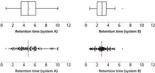
Scatter plots allow you to see how the points are scattered along one variable. For instance, say you are developing a chromatographic method intended to be applicable to a large variety of analytes and you would like all the analytes to be well separated in your chromatographic system. In the example shown in Figure 2, the scatter plots make it clear that system A offers much better separation power for the set of analytes than system B. Box and whiskers plots (2), as shown in the upper section of Figure 2, will give similar views, with additional information on the position of the medians and quartiles.

Figure 2: Scatter plots and box plots can help us observe chromatographic retention in different chromatographic systems for the same sample set.
Next: Linear Regression Analysis
In the next installment, I will discuss the simplest method of statistical analysis: linear regression analysis.
References
- D.L. Massart and Y. Vander Heyden, LCGC Europe17, 467–470 (2004).
- D.L. Massart et al., LCGC Europe18, 215–218 (2005).
Caroline West is an Assistant Professor at the University of Orléans, in Orléans, France. Direct correspondence to: caroline.west@univ-orleans.fr.

How Many Repetitions Do I Need? Caught Between Sound Statistics and Chromatographic Practice
April 7th 2025In chromatographic analysis, the number of repeated measurements is often limited due to time, cost, and sample availability constraints. It is therefore not uncommon for chromatographers to do a single measurement.
Fundamentals of Benchtop GC–MS Data Analysis and Terminology
April 5th 2025In this installment, we will review the fundamental terminology and data analysis principles in benchtop GC–MS. We will compare the three modes of analysis—full scan, extracted ion chromatograms, and selected ion monitoring—and see how each is used for quantitative and quantitative analysis.
Rethinking Chromatography Workflows with AI and Machine Learning
April 1st 2025Interest in applying artificial intelligence (AI) and machine learning (ML) to chromatography is greater than ever. In this article, we discuss data-related barriers to accomplishing this goal and how rethinking chromatography data systems can overcome them.

.png&w=3840&q=75)

.png&w=3840&q=75)


.png&w=3840&q=75)


.png&w=3840&q=75)


