Calibration Curves, Part 3: A Different View
It's all in the perspective.
This is the third instalment in a series of "LC Troubleshooting" columns that focus on calibration curves used for liquid chromatography (LC) methods. We started by looking at the issue of whether or not to force a calibration curve through the origin (x = 0, y = 0).1 Last month we looked at some techniques to determine the limits of detection and quantification,2 specifically looking at the signal-to-noise ratio (S/N) as a tool in this process. This month we will consider some alternate ways to look at the data to determine if they appear to be normal or are trying to tell us that something is amiss. Next month we'll look at some different calibration techniques.
The Conventional Plot
Figure 1 shows a plot of a hypothetical calibration curve comprising five replicate injections of an exponentially diluted standard at concentrations of 1, 2, 5, 10, 20, 50, 100, 200, 500 and 1000 ng/mL. This presentation of the calibration curve looks quite impressive, with the coefficient of determination r2 = 0.9999. The y-intercept (0.0906) is less than the standard error of the y-intercept (SEy = 0.4979), so based upon earlier discussion,1 we can justify forcing the curve through the intercept.
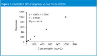
Figure 1
Although the curve statistics look impressive for Figure 1, such plots have marginal visual value for problem diagnosis. This is because most of the points are crowded together at the lower end of the curve, where there isn't much detail to be seen.
The %-Error Plot
Another way of plotting the standard curve data is the %-error plot, as shown in Figure 2 for the data set of Figure 1. In this case, both axes are changed. The x-axis (concentration) is plotted on a logarithmic scale instead of a linear one. This spreads out the data points across the graph, allowing more detail to be seen at the low concentrations. Often, we are less interested in the absolute response for a given concentration than how close that response is to the expected value. We can obtain this information by converting the response (y-data) into %-error from the calibration curve. This is quite simple. First, we use the regression equation for the curve to plot the expected response at each concentration. Because we can force the curve through the origin, we will use the y = mx format, which for the present curve is y = 1.0002x. Thus, a concentration of 2 ng/mL is expected to give a response of (1.0002)(2) = 2.0004. One of the 2 ng/mL injections gave a response of 1.8859. This is converted to %-error as:
%-error = 100 (response = expected)/expected [1]
or 100 (1.8859 = 2.0004)/2.0004 = –5.7% error. This value (x = 2 ng/mL, y = –5.7%) is plotted along with the remaining points to obtain Figure 2.
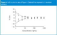
Figure 2
Figure 2 can give us additional information about the data that are not present in Figure 1. First, notice how the data begin to scatter more around the expected value (0% error) at values less than 50 ng/mL. And as the concentration is decreased, the scatter increases. This is reminiscent of Figure 2 of last month's "LC Troubleshooting",2 in which we observed a decrease in S/N with decreased concentration. Many of the errors in an LC method increase with decreasing sample concentration, such as weighing, volumetric and detection errors. These combine to give the expected increase in error at lower concentrations, which ultimately determines the lower limit of quantification and detection of a method.2 If the data are behaving normally, we expect the scatter in the data to be roughly equal above and below the expected values — and this is the case in Figure 2. If the data are distributed normally, we also expect that ≈68% of the values will lie within ±1 standard deviation (SD) of the mean — this would be three or four of the five injections at each concentration. I have plotted dashed lines at the ±1 SD limits in Figure 2, and it can be seen that, once again, the data behave normally.
These data give us assurance that, although there is more error at the lower end of the curve than at higher concentrations, the errors are distributed normally and behave as expected. This means that we can have more confidence in the results. Although the pattern of error — increasing error at lower concentrations — is inevitable, this does not mean that we will be unable to reduce the error at the test concentrations. Often, weighing out more reference standard and using larger dilution volumes will help reduce error, as will the use of volumetric glassware instead of graduated cylinders. Sometimes an internal standard will help to reduce error in sample preparation steps. Larger injections will result in larger peaks, which are easier to integrate, reducing the error in data processing. These, and other method improvements, will usually help to reduce the overall error of the method, which is generally most obvious at the lowest concentrations in the calibration curve.
When Something Goes Wrong
The %-error plot can help to highlight problems when they occur. Consider the example of Figure 3, which is based upon the same data as Figure 2, except I added a response equal to 0.1 ng/mL to every point. The regression statistics are almost identical (r2 = 0.9999 in both cases, y = 1.00022x for Figure 2 versus y = 1.00036x) for Figure 3), but the %-error curves look dramatically different. At higher concentrations, the bias is unnoticed (for example, 0.1 ng/mL increase at 50 ng/mL is only 0.2% change), but it is dramatic at low concentrations in this type of presentation. When we see a result such as that of Figure 3, we need to ask what could have gone wrong. What could have added a small response to all samples? Perhaps the final sample diluent is contaminated with a small concentration of the analyte — the same volume would be added to each sample. Maybe there is a glassware contamination problem, or other contamination that affects all samples. Start to track this down by injecting blanks of fresh solvents and the solvents used in sample preparation. Compare zero-concentration samples that have experienced all sample preparation steps with a direct injection of fresh solvent. The problem might be instrument-related — move the column and mobile phase to another LC system and try again.
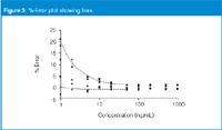
Figure 3
Sometimes bias, as in Figure 3, can be negative instead of positive. When I see such cases, I think of sample losses that can occur during sample preparation. I would first look at adsorptive losses, where a small, but relatively constant, loss of sample might occur. For example, adsorption on a filter membrane or filter apparatus; adsorption during an evaporation-to-dryness step; or other losses during solid-phase extraction or other sample preparation steps.
Another Example
The discussion so far is based upon hypothetical well-behaved (Figures 1 and 2) or intentionally biased (Figure 3) calibration curves. Let's look at some real data for the next example. In this case, data come from a method used to determine drug concentrations in plasma by LC with mass spectrometric detection (LC–MS). The curve comprises standards formulated at 0.1, 0.3, 0.75, 1, 3, 7.5, 10, 30, 75 and 100 ng/mL. A series of calibration samples is injected at the beginning and end of a sample batch and the calibration data from the two sets are combined to generate the calibration curve.
A %-error plot for the combined calibration data is shown in Figure 4. When compared with the data of Figures 2 and 3, you can easily see that there is much more scatter in the data, especially at high concentrations. However, for bioanalytical methods such as this, the acceptable limits are ±15% at all concentrations above the lower limit of quantification (LLOQ) and ±20% at the LLOQ. Almost all the data fall within ±15%, so technically the calibration curves meet these criteria. [Outlier tests allow rejection of the data points at (0.3 ng/mL, +24%) and (3 ng/mL, +17.7%).] A closer look at the data shows some interesting behaviour. The first calibration set is plotted as diamonds and the second as squares. Note that all the diamonds have %-error values >5%, whereas all the squares have %-error values <5%.
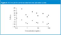
Figure 4
Another way to plot the same data is shown in Figure 5. Here, each calibration set is plotted on the same graph, but independently instead of as a combined set as in Figure 4. The change in appearance of the plot is dramatic. Whereas in Figure 4, the range in %-error was 35% (–10% to +25%), now the range is reduced by about half to 17% (–3% to +14%). Furthermore, the %-error at each concentration is quite similar — the diamonds and squares appear as pairs at each concentration. In any event, the plot of Figure 5 appears to be much better behaved than that of Figure 4, although it still has more error than the ideal curve of Figure 2.
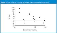
Figure 5
The information contained in Figures 4 and 5 suggests that something has changed between the time the first and second calibration curves were run. One possibility is the degradation of the calibration standards — the response was greater at the beginning than at the end. This, however, is unlikely, because a determination of the stability of the analyte is part of the validation process. But if the validation data showed questionable stability of the analyte, this would deserve additional investigation. In my opinion, a more likely source of problems is a change in the sensitivity of the detector over time. It is not uncommon with MS detection, especially with plasma samples that have undergone minimal clean-up (for example, only protein precipitation), to see a reduction in response as contaminants build up in the detector. Some ways to check for this might be to study the response of the quality control (QC) samples that should have been interspersed with the subject samples throughout the run. A check of historical data, if available, might also shine some light on the problem — is this loss of response a common occurrence or does it happen just for this sample batch?
Normally, an internal standard is used to correct for changes in concentration, sample loss, detector response and other errors that might occur during sample preparation and injection; internal standards were used in the present method. This prompted me to check to see if the same change in response was observed for both the analyte and internal standard (IS). When I compared the response–unit-concentration of the analyte and the response for the internal standard for each data set (Table 1), the relative standard deviation (RSD) was about the same for all four groups (analyte run 1, analyte run 2, IS run 1, IS run 2), falling within a range of ≈6–10% RSD. This says that the variability within each group was similar. Then I ran a Student's t-test on the two groups of analytes and two groups of internal standards. The results show no difference in the mean response (95% confidence level) for the two groups of analytes, but a significant difference for the response of the internal standard. So something was happening to specifically increase the response of the internal standard for the second calibration curve. This leads to another avenue of investigation. Was this a result of a sample preparation error, such as an error in pipetting the internal standard, or other systematic error? Additional study of the current data set, historical data and perhaps some specific experiments should help to track down the source of the problem.
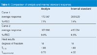
Table 1: Comparison of analyte and internal standard response.
Conclusions
We have seen that a %-error plot of calibration data allows us to examine experimental results more carefully. Plotting concentration on a log scale spreads out the data points across the graph, minimizing crowding at low concentrations, so that individual data points are seen more easily. Plotting response as %-error from the expected (regression line) value normalizes the data set in a way that helps to highlight normal or abnormal behaviour of the calibration curve. Normally, an increase in %-error is expected at low concentrations, due in part to the decreased S/N, which results in greater integration error. Bias will be highlighted in the %-error plot, helping to identify problems that might otherwise be overlooked. In the last example, the observed offset between the two calibration curves in the %-error plot lead to further comparisons of the response of the calibration standards, and a problem with the response of the internal standard was highlighted. If you don't use them already, I strongly advise you to use %-error plots of calibration data to help visualize potential problems with your method.
"LC Troubleshooting" editor John W. Dolan is vice president of LC Resources, Walnut Creek, California, USA; and a member of the Editorial Advisory Board of LCGC Europe. Direct correspondence about this column to "LC Troubleshooting", LCGC Europe, Park West, Sealand Road, Chester CH1 4RN, UK.
For an on-going discussion of LC Troubleshooting with John Dolan and other chromatographers, visit the Chromatography Forum discussion group at www.chromforum.org
References
J.W. Dolan, LCGC Eur., 22(4), 190–194 (2009).
J.W. Dolan, LCGC Eur., 22(5), 244–247 (2009).
Erratum
In LCGC Eur. 22(4), p 192, the y-axis of Figure 1 is mis-labelled. The scale should cover the range of 0–1000, not 0–2000.

Accelerating Monoclonal Antibody Quality Control: The Role of LC–MS in Upstream Bioprocessing
This study highlights the promising potential of LC–MS as a powerful tool for mAb quality control within the context of upstream processing.
Using GC-MS to Measure Improvement Efforts to TNT-Contaminated Soil
April 29th 2025Researchers developing a plant microbial consortium that can repair in-situ high concentration TNT (1434 mg/kg) contaminated soil, as well as overcome the limitations of previous studies that only focused on simulated pollution, used untargeted metabolone gas chromatography-mass spectrometry (GC-MS) to measure their success.
Prioritizing Non-Target Screening in LC–HRMS Environmental Sample Analysis
April 28th 2025When analyzing samples using liquid chromatography–high-resolution mass spectrometry, there are various ways the processes can be improved. Researchers created new methods for prioritizing these strategies.
Potential Obstacles in Chromatographic Analyses Distinguishing Marijuana from Hemp
April 28th 2025LCGC International's April series for National Cannabis Awareness Month concludes with a discussion with Walter B. Wilson from the National Institute of Standard and Technology’s (NIST’s) Chemical Sciences Division regarding recent research his team conducted investigating chromatographic interferences that can potentially inflate the levels of Δ9-THC in Cannabis sativa plant samples, and possible solutions to avoid this problem.

.png&w=3840&q=75)

.png&w=3840&q=75)


.png&w=3840&q=75)


.png&w=3840&q=75)


